…and choosing the right one!
Years of conventional kitchen color planning have revealed that it is the earthy, warm and bright colors that are most effective in establishing not only a pleasant atmosphere to cook in, but a friendly one to visit as well. The colors fulfill many roles; besides reflecting light they tie the room together. They also establish a welcoming quality, a trait not to be underestimated when it comes to selling your home. As Lee Wallender at TheSpruce.com explained, there is much to consider if you wish to select the right color scheme for your kitchen.
When it comes to design there are common kitchen rules that have been observed for years. For instance, very dark colors and cold neutrals such as blues, purples, greens, violets and a variety of hues in comparable families do not promote hunger (or so it is believed). They are not at all considered ideal for kitchens. Any such color would mark an interesting color strategy, to be certain, because ultimately the color of a kitchen should reflect the personal preferences of the owner. There are certain examples that should be followed regardless. For instance, black is universally considered to be a poor choice despite having been successfully used when paired in sharp contrast with stainless steel or a color in the white range.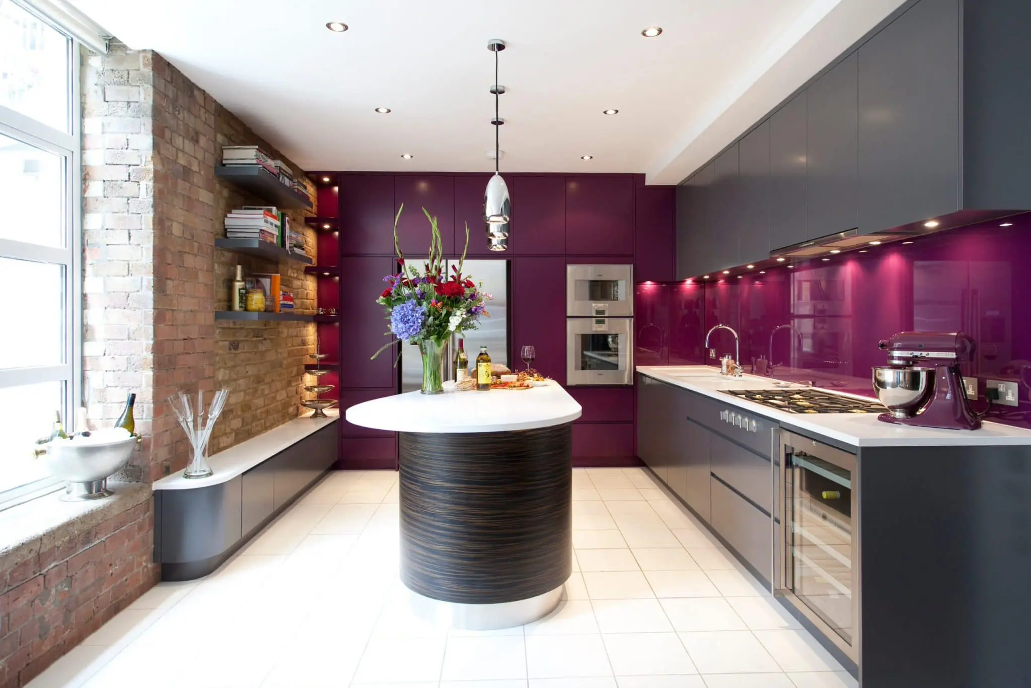
Did you know that just about any color can become a neutral one? All it takes is the right amount of shade or tint. You simply need to determine the kind of neutral tone you think would work best. There’s no need to be concerned about choosing poorly and getting it all wrong. When it comes to mid-range neutrals it’s very difficult to make a severe mistake. And although there are those who dismiss the mid-range neutrals as “dull”, it is not hard to add life to the room they occupy. Simply add colors. The addition of red, yellow, or orange will serve to warm up any neutral. On the other hand, they can be cooled down with colors such as violet, blue or green.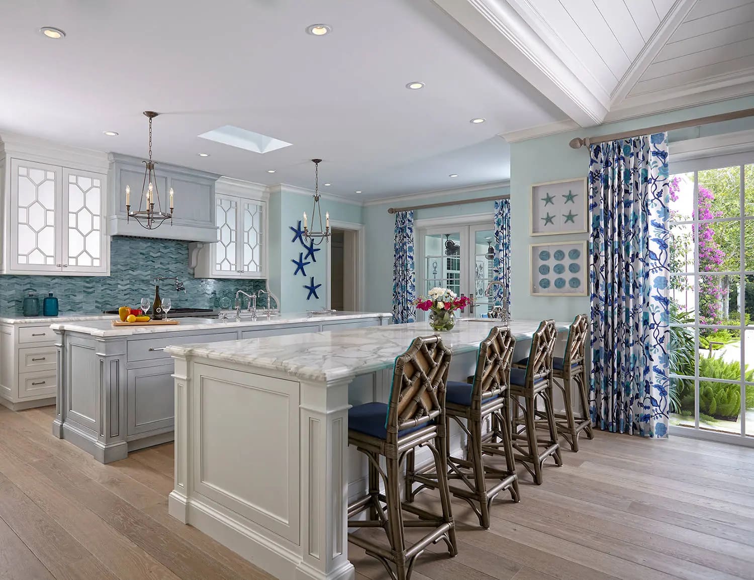
In the case that you want to be fabulous and really add some kick to the room, a color uncommon for the kitchen may be your best bet – red. Sure, it’s not for everyone, but it can break up a bleak motif that is established by a collection of dark colors. In fact it can be the appreciated focal point in such an arrangement and with a dreary atmosphere it may be just the medicine needed to offset the gloominess and make the unusual montage of colors a true mark of original style.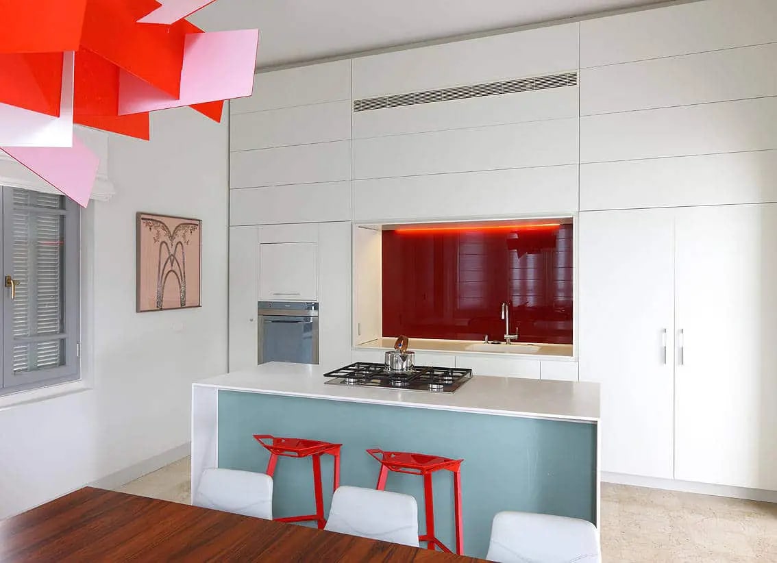
Another theme to consider is one of rich browns. Earth-friendliness is cool, and the trend is reflected in the wealth of earthy colors that are available. Brown, obviously, suggests visions of soil, the earth, the farm, it’s a safe color even for those who’re not at all fans of neutrals. There is an endless wealth of possibilities when it comes to brown. There are so many shades, and of course it works flawlessly with black or green. Currently it is the deeper browns that seem to be in favor for kitchens.

Arguably, there is perhaps none more of a classic look for the kitchen than simple white. All-white kitchens have been promoted successfully for years. It’s just as it sounds – white cabinets, white walls, white ceiling, maybe a white counter… it’s all white basically. Of course there are many options to offset the feeling of snow blindness, from sharp contrast to subtle ones. But the fact is, a white dominant kitchen is a wide open and enjoyable palette to work with. The sky is the limit (if you add blue).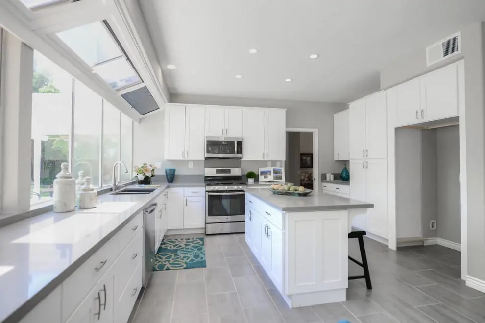
Nor far from white is the toned down version of yellow that has become a hit in kitchens 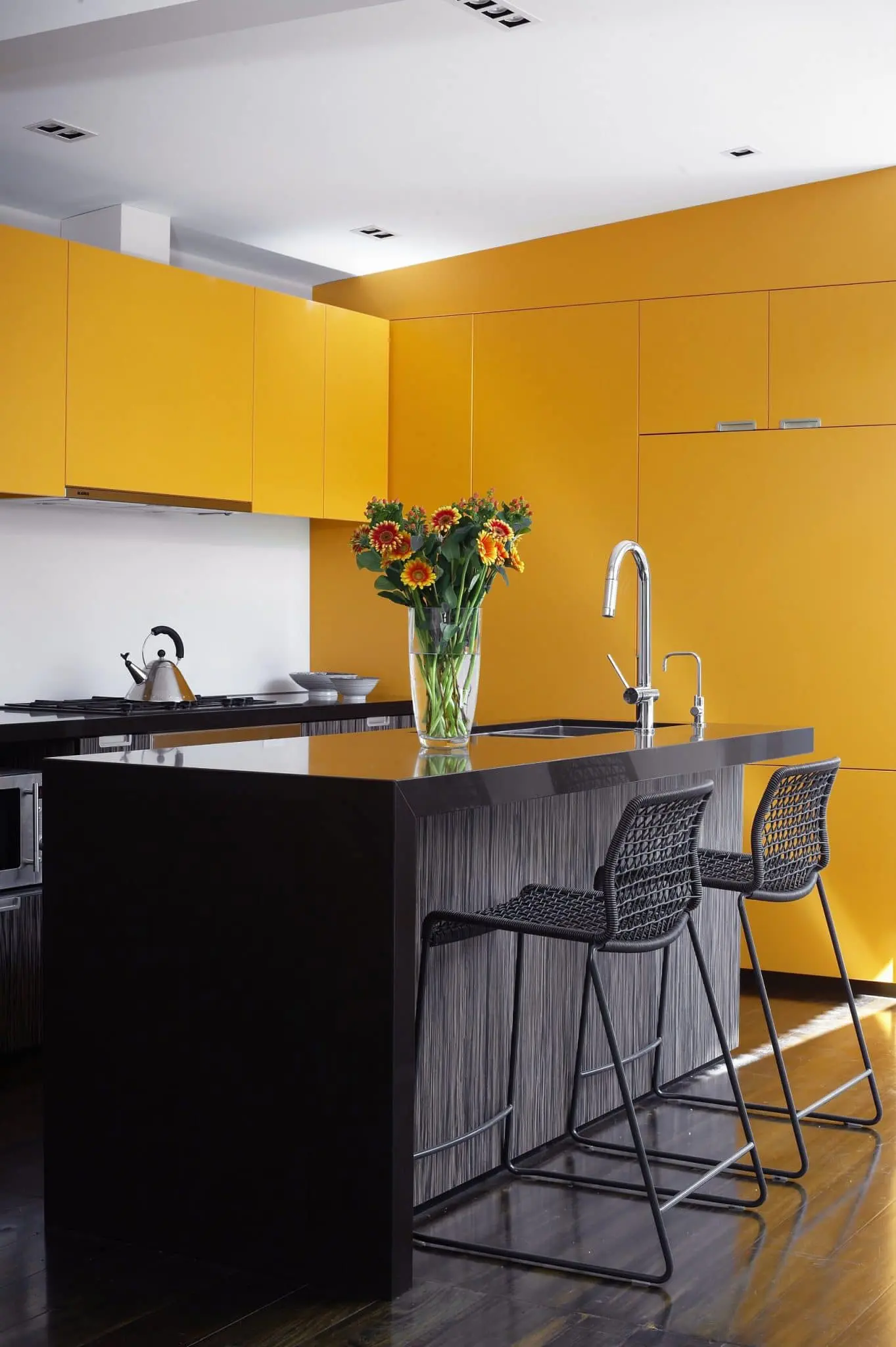 over the past decade. Light yellow is casual enough that there is nothing alarming about it. It also has enough character to complement the majority of kitchen cabinet wood species. It is reflective of ambient light, much like whites, and perfect for enlivening the dimmest of rooms. Or you can go with a deeper yellow and pair it with just a bit of black for a classic theme – the choices are there.
Not everyone wants their kitchen to promote cheer, nor do they want it to be drab or depressing. But there is a subtle medium. The use of blue, for instance, is not likely on anyone’s radar as an ideal color for the kitchen. It’s associated with the melancholy genre known as “the Blues” and as if it was a symptom of depression, does little to stimulate appetite or joy. But blue does have something going for it, a true vintage vibe, easily providing a retro cottage-like appeal. And, used sparingly as an accent color, blue really can be made to work in just about any kitchen.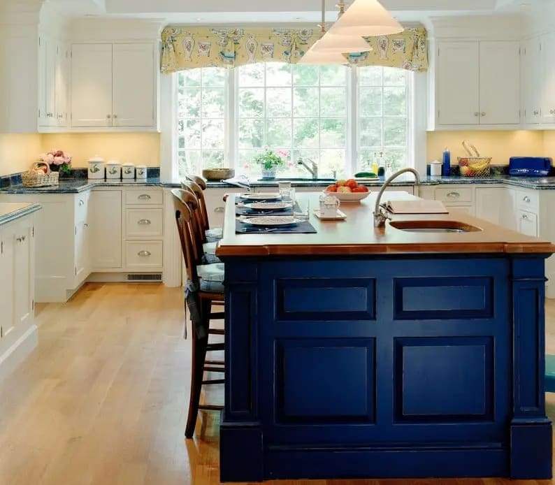
How do you know if you’ve chosen the right color? When it works for you and you have no doubts or regrets about your choice. You can follow all the tips and advice, but ultimately it’s what you’re happy with that will matter.
Bonus: See the most preferred colors by State!


