If you pay attention to fashion or interior design trends, you will hear phrases like “Mint green is the new neutral” or even “Orange is the new black.”
But what does this mean when using neutral color schemes in your new room? How can this be applied to your home interior in the best way possible?
What is a Neutral Color

Neutral colors are difficult to define because there are many variants of them. For example, if you paint a room “white,” you must know which version of “white ” to use. Otherwise, the colors won’t match.
Another stated definition for neutrals is “appears without color,” but this feels too vague.
Using white alternatives, the difference between ivory, beige, and gray is the color mixed with the white, known as an undertone.
An undertone is a color that affects the overall hue. If you add a little yellow to mostly white paint, the paint is mostly white but has a faint yellow tint.
However, one site classifies neutral colors as “hues not in the color wheel.” The color wheel consists of primary colors, which are red, yellow, and blue, and the secondary colors, which are orange, green, and purple.
The final definition of neutral colors is “colors that are not bold.” In a nutshell, the more muted and subdued versions of existing colors will usually appear as neutrals.
If you combine these definitions, you will better understand what a neutral palette really is than just any one descriptor.
Why Neutral Colors are Important in Interior Design
People often perceive neutral colors as generic, but in interior design, they serve as essential canvases to highlight specific features in a room.
They become the best background for different textures as they are not bold, do not attract the eyes, and do not demand attention.
Materials like marble are usually popular in white or black to enhance the significant veining in that stone.
Wood is usually a neutral brown, so its natural grain is a spotlighted feature that the hue enhances. Since much of nature has some level of brown, many earth tones fall into the neutral color palette.
Neutrals are considered timeless since they are not bold enough to go out of fashion. This classic style choice will most likely still look good in ten or twenty years in your home.
Since the neutral palette is subdued, it is more calming than stimulating compared to a bright red or blue. So, neutrals are a good choice in places where you want to relax, such as the bedroom and living room.
Looking at the different neutrals and how to use them.
Monochromatic Neutral Colors
Black and white are two of the most popular neutral choices, with black absorbing and white reflecting all colors. While they are recognized in popular culture, physicists do not consider them colors because they have no specific wavelength.
This factoid appears to have no relevance in interior design. Yet, the hues that are least represented on the color spectrum are considered the most neutral.
While black and white are neutrals on the polar ends, they don’t have the same effect as neutral colors in interior design.
When white is the base neutral in a room, it tends to be brighter and more spacious. White works best in making smaller rooms seem bigger. Since white is reflective, even when it is matte, it amplifies any light in the room.
When black is the base neutral in the room, it reads as sophisticated and dramatic and may feel intimate. Any light in the room becomes the necessary focus, creating dramatic shadows and contrast.
Off-white

Off-white is a popular type of neutral that includes all variations of white with an undertone of another hue.
The most popular off-whites are ivory, with yellow undertones, and beige, with brown undertones. This option is for those who want a color similar in brightness to white but don’t want the colorlessness.
Some people feel that pure white is too cold and sterile, like a hospital. Others feel like a pure white room is so clean that they are afraid to add color. Using off-white may work as a better canvas since the undertone can begin to inspire a color palette.
Off-black (Shades of Black)

Most people may not be aware that there is an off-black that works similarly to off-white but with black-related hues.
The difference is important if this black is under the light because you will see an undertone reflected in the light. The most popular variations of black include charcoal, espresso, and midnight blue, which, although called “blue,” are intensely dark.
Gray

Gray is several variations of white and black. Contrary to popular culture, there are more than 50 shades; there are 256 recognized shades, which include black and white.
While people have strong opinions on black or white, they tend to have even stronger views regarding the neutral grey. Black and white can complement any other color, but people debate whether grey has that same ability.
The key is if the gray has the same “lightness” as the other colors. The closer the lightness matches, the more compatible that version of grey is.
Lighter grays in a room are more calming, even if we associate them with gray skies. Darker grays feel more intimate and mature without the dramatic boldness of straight black.
Since silver is a metal and has a greyish tone, people perceive it as neutral. This makes silver a popular choice in hardware choices such as handles and knobs, as it complements almost any shade or color.
Brown

Of all the colors, brown is the most prevalent. Brown is created by mixing all three primary colors, red, yellow, and blue.
Brown is the most varied neutral color, and if you add black and white to add more depth, it becomes even more varied. The most popular browns seem to be inspired by food such as coffee, chocolate, cocoa, and chestnut.
Other notable browns include beige, khaki, sand, and tan.
Since all colors are represented in each brown shade, it can carry the accents of other colors next to it. So if a brown is next to orange, the brown looks more orange, especially browns with red and yellow undertones.
If an orange-brown is next to the contrasting color blue on the color wheel, the difference will be more highlighted.
One of the most essential browns in interior design is wood, which is used in many pieces of furniture. Wood is a required neutral if you aim for a natural interior.
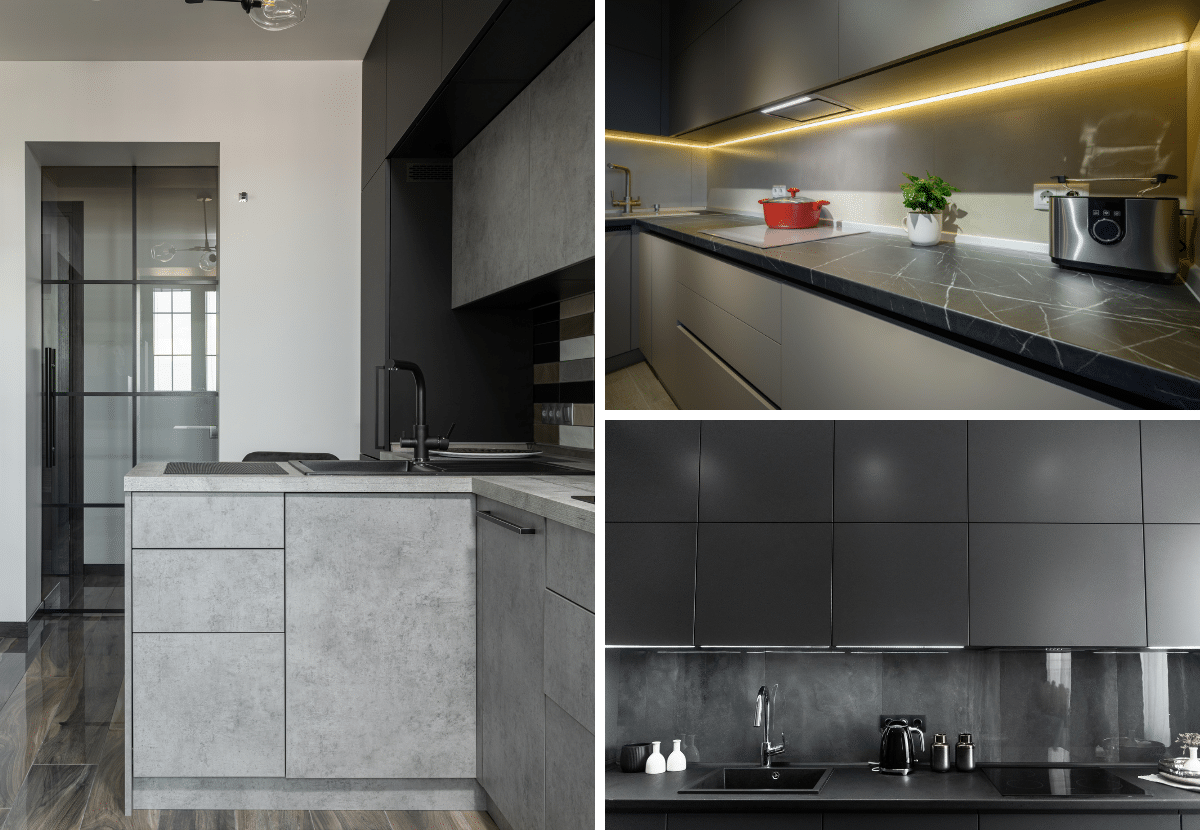
Best Neutral Kitchen Cabinet Colors
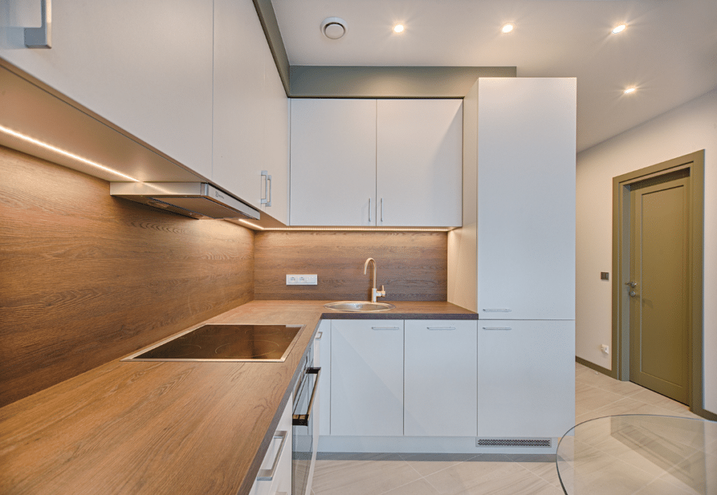
According to Abodian, neutral colors are great for kitchen cabinets as they never go out of style and work well with almost any kitchen design. They create a bright and airy feel while remaining classic and easy to match with other kitchen design elements.
The best neutral kitchen cabinet colors are white, gray, beige, and greige.
White cabinets work well in both traditional and modern kitchens. Due to its versatility, it can be paired with various hardware and countertop materials, making it a popular option for kitchen interiors.
Gray cabinets are another versatile neutral option that comes with different levels of saturation and undertones such as blue, green, or brown.
Beige cabinets bring a sense of warmth to the kitchen and can be a great backdrop for pops of color. They complement both light and dark countertops and are usually incorporated in both traditional and modern-style kitchens.
Greige cabinets offer a balance between the warmth of beige and the coolness of neutral gray. It is the best choice for those homeowners looking for a more interesting color than a mere white or gray cabinet color.
Final Thoughts
Neutral colors do not demand attention, but they provide a timeless and flexible foundation that enhances the aesthetics of any interior space. Using neutral colors allows you to create a calm interior space that balances light, texture, and accent tones.
In addition, neutral colors provide a seamless backdrop for the home’s furnishings and accessories, allowing for easy updates and customization over time.
So, whether you prefer a minimalist, modern interior space or a classic, timeless ambience, neutral colors empower you to create an interior design that’s not only elegant but also welcoming.


